“We must understand and practice an accessibility that moves us closer to justice, not just inclusion or diversity … We need to think of access with an understanding of disability justice, moving away from an equality-based model of sameness and “we are just like you” to a model of disability that embraces difference, confronts privilege and challenges what is considered “normal “on every front. We don’t want to simply join the ranks of the privileged; we want to dismantle those ranks and the systems that maintain them.”
– Mia Mingus, Changing the Framework: Disability Justice
![]() [Image Description: Reimagining Accessibility Design Challenge finalists with the Countess of Wessex, Lieutenant Governor of Ontario David C. Onley, and Dr Sara Diamond]
[Image Description: Reimagining Accessibility Design Challenge finalists with the Countess of Wessex, Lieutenant Governor of Ontario David C. Onley, and Dr Sara Diamond]
Yijin Jiang, Julie Buelow, Arief Yulianto, and Taghreed Al-Zubaidi, all students in the Inclusive Design Graduate Program at OCAD University, were finalists in the 2013 Reimagining Accessibility Design Challenge hosted by OCAD U. The design challenge’s intent was to create an inclusive logo to replace the traditional International symbol of access – a solid blue square overlapped with an image of a white stick figure – a wheelchair user.
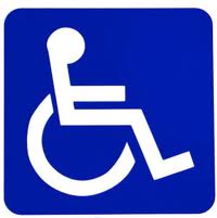 [Image description: traditional International symbol of access – a solid blue square overlapped with an image of a white stick figure – a wheelchair user.]
Jutta Treviranus, director of OCAD U’s Masters of Design in Inclusive Design program, introduced the 2013 Design Challenge: “Symbols we use are not passive statements… (rather) powerful means of framing our attitudes and promoting specific points of view. Accessibility has a human face… it is active, social and requires our evolving creativity… something benefiting us all individually and as a society.”
Site-Specific approached the design team to discuss the role creativity plays in advancing their understanding of accessibility and equity. Yijin Jiang, with a research interest in art and graphic design and user interface design, discussed the limitless possibilities of representing human potential through the infinite symbol. Arief Yulianto explains that creativity itself has a flexible form that makes it able to be connected with important principles such as fairness, inclusiveness, and diversity. Taghreed Al-Zubaidi, spoke of giving life to the symbol of access and its need to be global in meaning and language, while respecting disability. Julie Buelow whose interest is in designing mobile interfaces for seniors and providing a business model case for non-profit organizations, highlighted the duality of inclusion and exclusion when examining disability.

[Image description: final symbols created by the design team, featuring a stylized infinity symbol in red, blue, and yellow, as well as grey-scale]
These thoughtful reflections fuel yet a deeper interest: the unseating of assumptions of disability and access that reside within our physical, political, and social structures. The Reimagining Accessible Design Challenge requires us to examine how disability continues to be thought of as an individual phenomenon, as a problem located within individual bodies, rather than as a social construct.
The international symbol of access exists because access is not universally available to all. Tanya Titchkosky asks us to pose the question, “who are we when we belong and where?” She says, “Access signs read: ‘Here you can enter… maybe. But beyond your entrance regard yourself as a questionable participant: you may or may not get to classrooms, you may or may not pee, you may or may not visit your professors or colleagues. This sign means you are our collective partially imagined may-be.’ This is an ambiguous welcome – put up an access sign and a may-be participant is made. The sign now marks a kind of distress. And what should be done with signs that are pointing to the ambiguity of belonging, the partiality of participation, the uncertainty of certain sorts of people?” (From: The Question of Access. Disability, Space, Meaning by Tanya Titchkosky)
The Reimagining Accessibility Design Challenge and the issues that it examines and raises, makes one wonder: Is it possible to symbolically represent the work—with all its frayed edges—of advancing equity and social justice, of building community, of advocating for human rights, and of the questioning and undoing of inequitable social structures?


